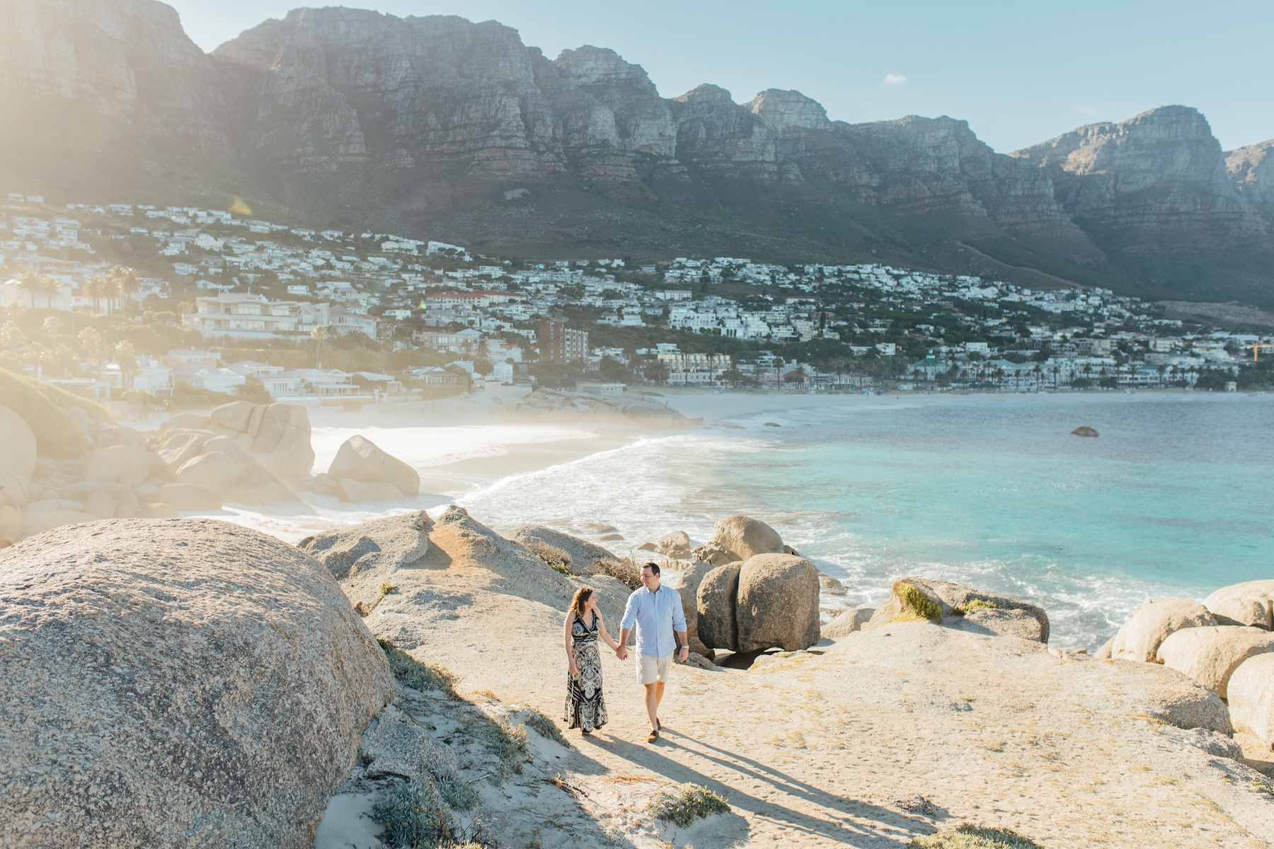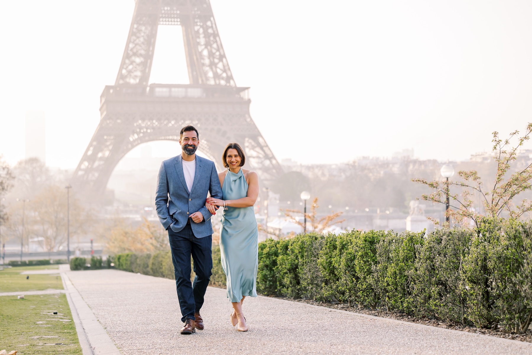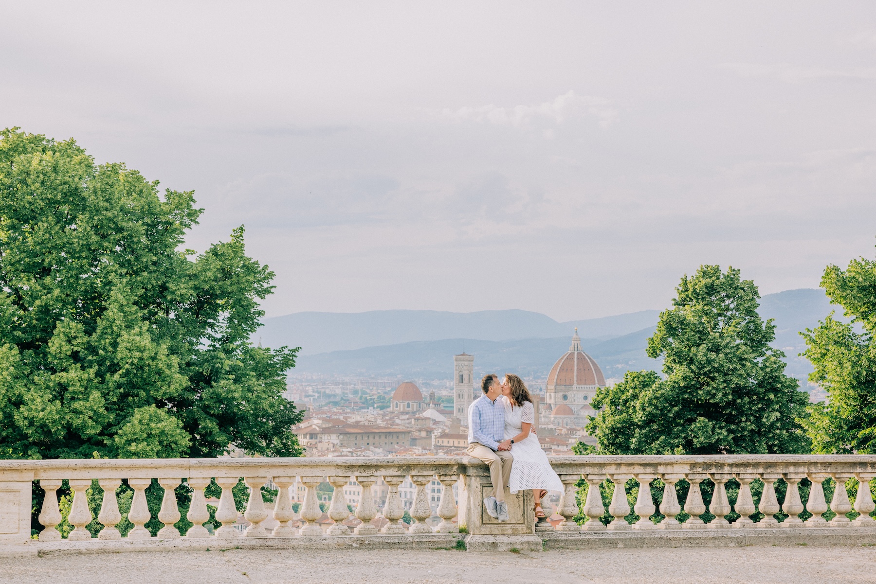
Flytographer Brand Style

Header photo by Leo in Paris 

In addition to amazing customer service and a personalized local experience, Flytographer is proud to offer our customers high-quality images from experienced creative professionals like you! While honouring and respecting your style as a photographer, we’ve put together this Brand Style Criteria so customers can expect a consistent outcome no matter which destination they book.

Think of it like the second shooters you contract for your own business: you want them aligned closely enough with your style that every image feels cohesive for your client, and the same goes for Flytographer. Our customers expect a similar look and feel whether they book in New York, Lisbon, or Cape Town, so if your personal editing style differs from ours, think of it as having two styles: one for your own business, and one for Flytographer shoots.

Please read through the criteria below carefully, they outline exactly what “meets,” “exceeds,” and falls “below” our brand standard, with real examples from shoots around the world. Note: if a customer specifically requests something outside our brand style (eg. dark, moody shadows), be sure to flag it to the concierge team ahead of time if it’s before the shoot, or in your check-in notes.

Table of Contents

  1. Composition & technical quality
  2. Colour & editing
  3. Posing & expression
  4. Culling & gallery quality
  5. Details & presentation
  6. Location & sense of place
  7. Flash policy
  8. Additional notes

1. Composition & Technical Quality

Brand Style: Sharp, straight, and nothing cut off.

  • Shoot in a proper 3:2 or 2:3 ratio and keep your horizons level. If you’re going for an intentional tilt, make sure it reads as a choice, not a mistake.
  • For wide or full-body shots, double-check that everyone’s feet and limbs actually made it into the frame. Nobody wants to be the customer missing a foot in their favourite shot!
  • Keep everything crisp and in focus, with even, flattering light. Exposure should feel balanced, not blown out or muddy.
  • White balance matters more than people think. Take a second look before you submit and make sure skin tones and backgrounds look natural, not off-colour.

2. Colour & Editing

Brand Style: Natural, warm, true-to-life, and timeless over trendy.

  • Keep skin tones accurate and natural across the whole gallery. If one image looks warmer or cooler than the rest, it’ll stick out, so aim for consistency shot to shot.
  • Steer clear of heavy presets or filters. Our brand promise is timeless, true-to-colour images, not a moody or filmy look that’ll feel dated in a few years.
  • Bright and warm doesn’t mean oversaturated. Check that colours still look believable, not cranked up.
  • If you’re ever unsure whether an edit is “on brand,” ask yourself if it’ll still look great in ten years. If the answer’s no, dial it back.

3. Posing & Expression

Brand Style: Relaxed, joyful, and real.

  • Watch for closed eyes and awkward expressions before you submit. A blink can turn a great shot into a reject.
  • Mix it up! Aim for a variety of natural, candid poses alongside more traditional ones so the gallery doesn’t feel repetitive.
  • Keep an eye on camera angles. The wrong angle can distort or unflatter even a great pose, so shoot from angles that flatter your customer.
  • The goal is customers who look comfortable and having fun, not stiff or posed within an inch of their life.

4. Culling & Gallery Quality

Brand Style: Every image earns its place.

  • Only submit your strongest shots. If two images are nearly identical, pick the better one and cut the rest, don’t pad the gallery with duplicates.
  • Mix up your orientations, backdrops, and framing so every image feels distinct from the last.
  • Think about the story your gallery tells. Sequence your images so they flow logically and feel like a cohesive set, not a random grab bag.
  • Remember, a tight gallery of knockout shots will always outperform a bigger one padded with filler. Quality over quantity, every time.

5. Details & Presentation

Brand Style: Camera-ready, no distractions.

  • Scan the background before you shoot and again during your edit. Litter, photobombers, and awkward backdrops are easy to miss in the moment but obvious in the final gallery.
  • Watch for wardrobe issues like bra straps, sweat stains, or tags sticking out. A quick fix on-shoot saves you editing time later.
  • Small corrections go a long way. Straightening a collar or smoothing flyaway hair before you press the shutter is often faster than fixing it in post.
  • Above all, help your customer feel confident. If something’s fixable and it’ll make them feel better about the shot, take the extra second to fix it.

6. Location & Sense of Place

Brand Style: Make the destination part of the story.

  • Use your location as more than a backdrop. Let the architecture, environment, and light actively contribute to the image, not just sit behind your subject.
  • Vary your distance and vantage point. Mix in wider, environment-focused shots with closer portraits so the gallery captures a real sense of place.
  • Ask yourself if someone could tell where this shoot happened just by looking at the gallery. If not, look for ways to bring the destination in more.
  • Don’t shoot everything from the same spot or angle. Variety in depth and perspective is what gives customers a real sense of scale and place.

Flash Policy

Brand Style: A well-lit shot beats a dark one, every time.

  • Flash is fair game when conditions call for it, think indoor venues or low-light settings where natural light just isn’t enough to work with.
  • A clean, well-executed flash shot is always the better choice over one that’s dark, grainy, or underexposed. Don’t be afraid to use it when you need it.
  • If you do use flash, make sure the lighting stays even and flattering. Harsh, direct flash can wash out skin tones or create unflattering shadows, so take a second to check your exposure.
  • The goal is for flash shots to feel consistent with the rest of your gallery, not like a jarring shift in style. Keep the same warm, natural look even when you’re supplementing with flash.

A Few More Things to Keep in Mind

  • Quality over quantity, always. A tight gallery of 35 knockout images will outperform those same 35 padded with near-duplicates every time. Customers judge the whole gallery, so even a few weaker shots can drag down how they feel about your strongest work.
  • Customer requests come first. If a customer asks for something outside the norm, like vertical-only shots, only posed images, or a single backdrop, honour that request over the standard criteria. If a request falls outside a reasonable scope (say, a dramatically different editing style than your usual portfolio), message your concierge before proceeding.
  • Black and white images count as duplicates. If you submit a black and white version alongside its colour original, it won’t count toward your final delivered image count, and black and white shouldn’t be your feature photo.
  • Can’t hit the minimum image count? Reach out to your concierge team for support and next steps rather than padding the gallery with weaker shots.
  • Technical skill isn’t the whole story. How comfortable and confident your customer feels matters just as much. Great energy on-shoot translates directly into better images and happier customers.
  • Small retouches go a long way. You’re not expected to do major retouching like blemish removal or body modifications, but easy fixes are always appreciated. Straightening a collar, smoothing flyaway hair, or fixing a bra strap on-shoot saves you editing time later and makes for a stronger final gallery.

Thank you for taking the time to review the Flytographer Brand Style! We can’t wait to see the incredible travel memories you capture for our customers. If you have any questions, please feel free to reach out to our Photographer Support Team or email us at photographer@flytographer.com.

Pin It on Pinterest